The new Papillon website
A light design, a page for every feature, a blog and an English version: papillon.bzh gets a fresh start.
 Vince LiniseTranslated by AI
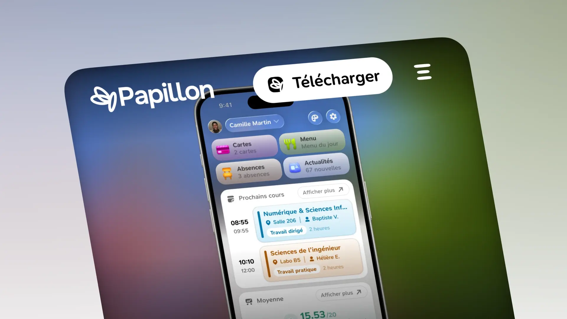
papillon.bzh has completely changed. The site moves from a dark theme to a light design that matches the app, every feature gets its own page and its own color, the association and the project's story are told in detail, and we're launching a blog. All of it in French and English, on desktop and on mobile.
papillon.bzh is Papillon's shop window. It's often the first thing people see of the app, before they even download it. And as of today, it has completely changed.
New design, new pages, a blog, an English version... So, what changed?
The old site
The old site fit in three pages: home, association and download. A dark background with green highlights, a big title saying "Votre vie scolaire, avec de la magie en plus." (your school life, with a bit of magic), and an iPhone held in a hand to show off the app.
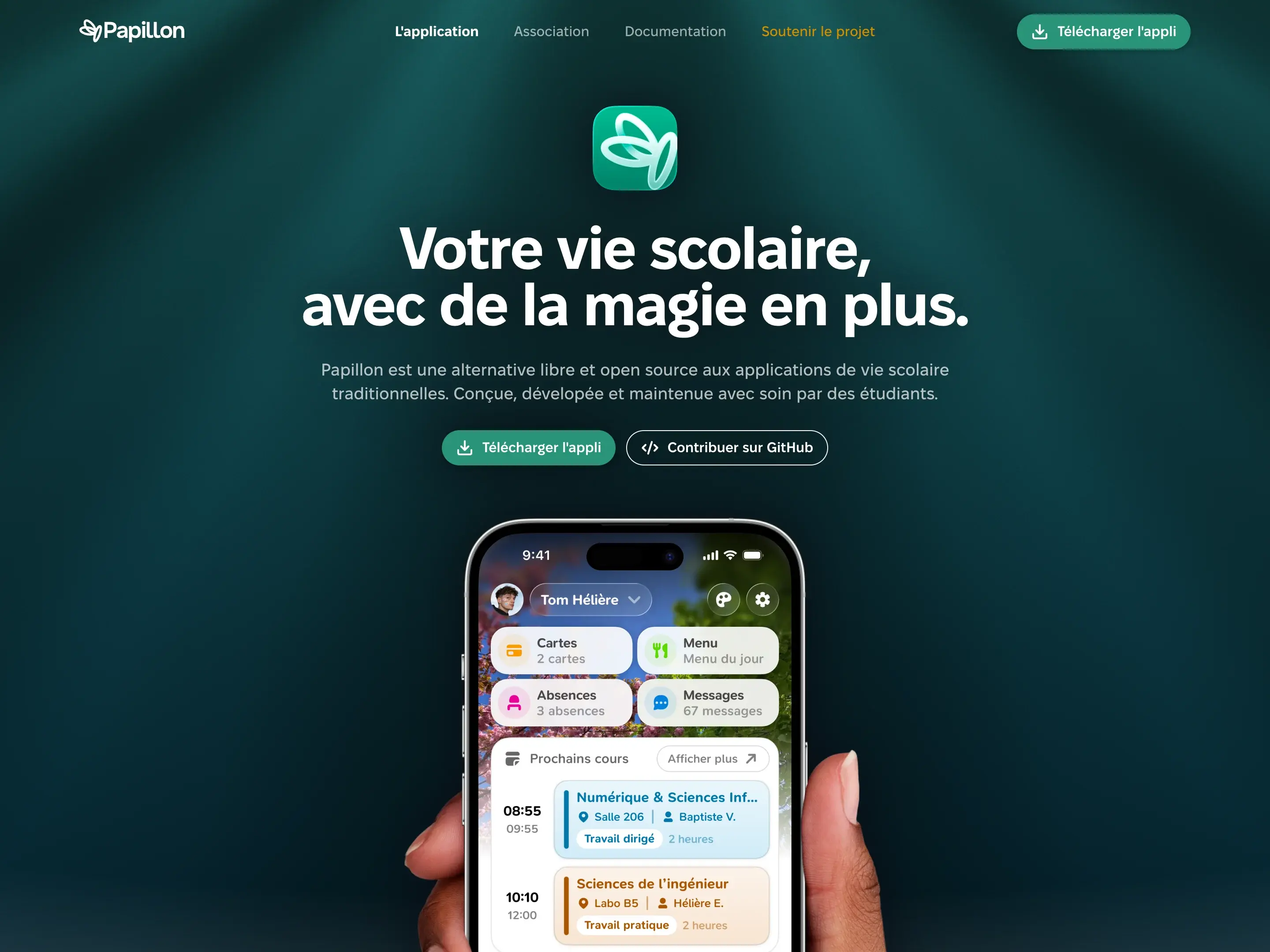
It did its job well. But over time, it wasn't enough anymore, in particular:
- Too little room: every feature fit into three blocks on the home page. No way to explain how the average is calculated, or what the schedule does when a class is cancelled.
- No news: nowhere to talk about updates or what happens behind the scenes, apart from our social networks.
- French only: even though Papillon is available in many languages.
How could we do better?
A site that looks like the app
The first change is obvious right away: the site goes light. White background, black text, and Papillon green for the buttons. Just like in the app.
We also brought over the app's typeface, SN Pro, with the same weights as in our Figma mockups. Cards, corner radii and icons (our Papicons, of course) all come from the same design system. The result: going from the site to the app, you stay in the same world.
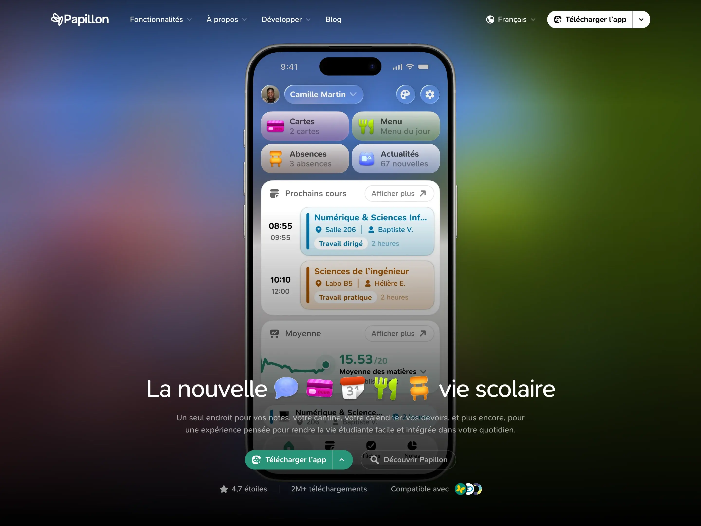
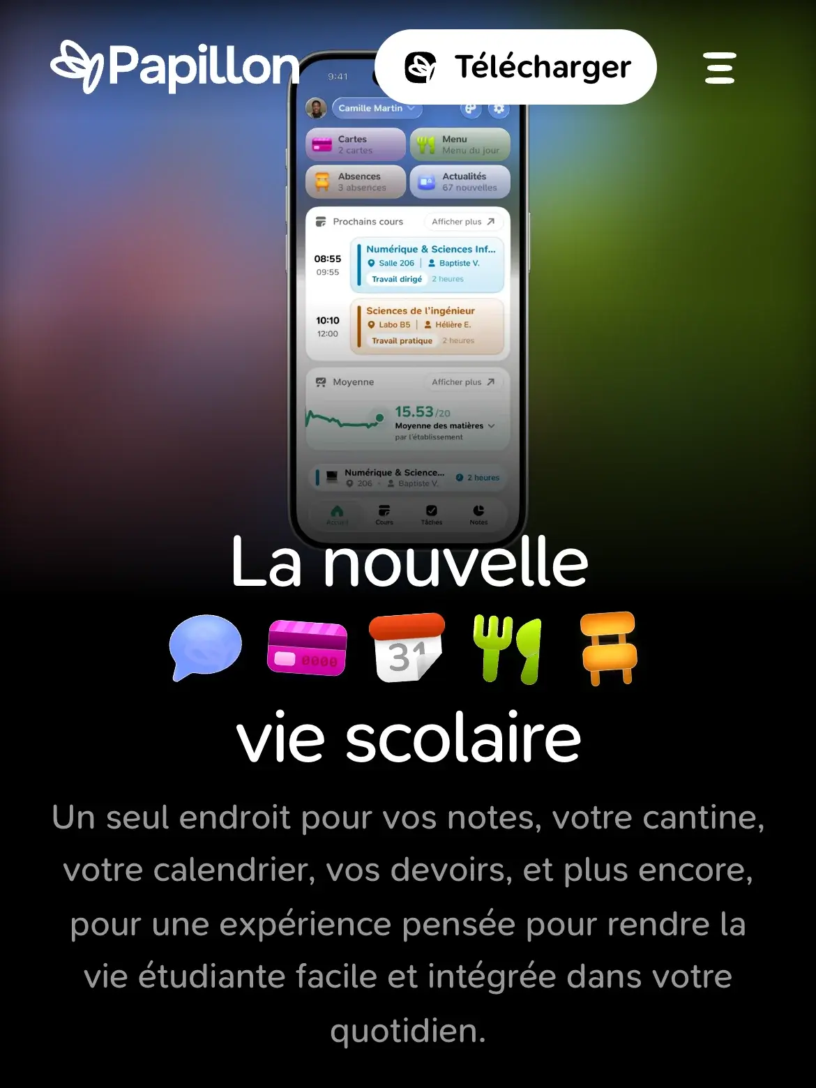
The home page still opens on a dark hero: a video of the app revealing itself, and a "La nouvelle vie scolaire" title with the app's emojis animating between the words. Then, within the first few pixels of scrolling, the page fades from black to white, and the navigation bar switches along with it.
A redesigned navigation
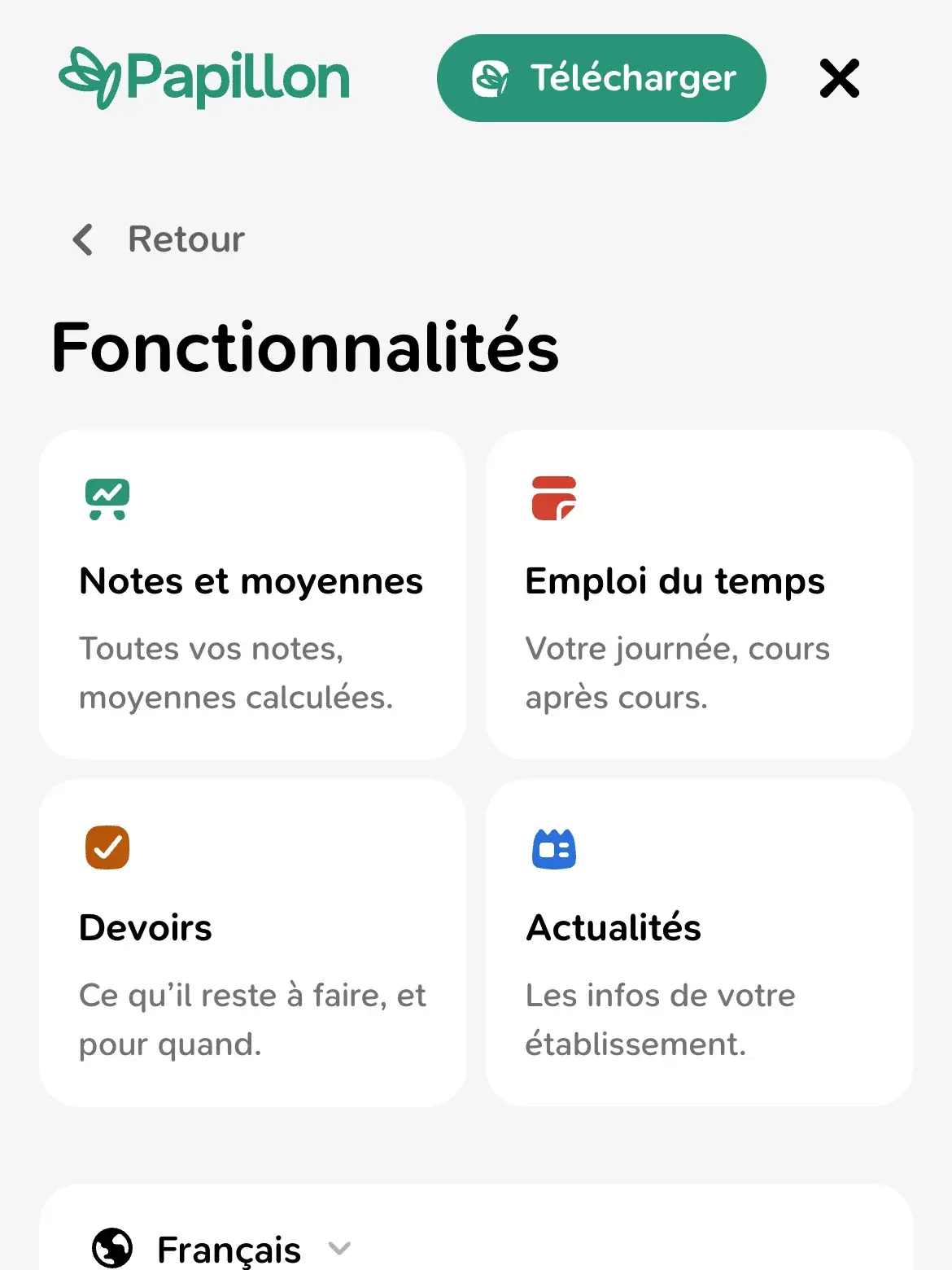
The navigation was fully redesigned around four menus: Features, About, Developers and Blog. The features menu shows a preview of each page, with a piece of the app's interface.
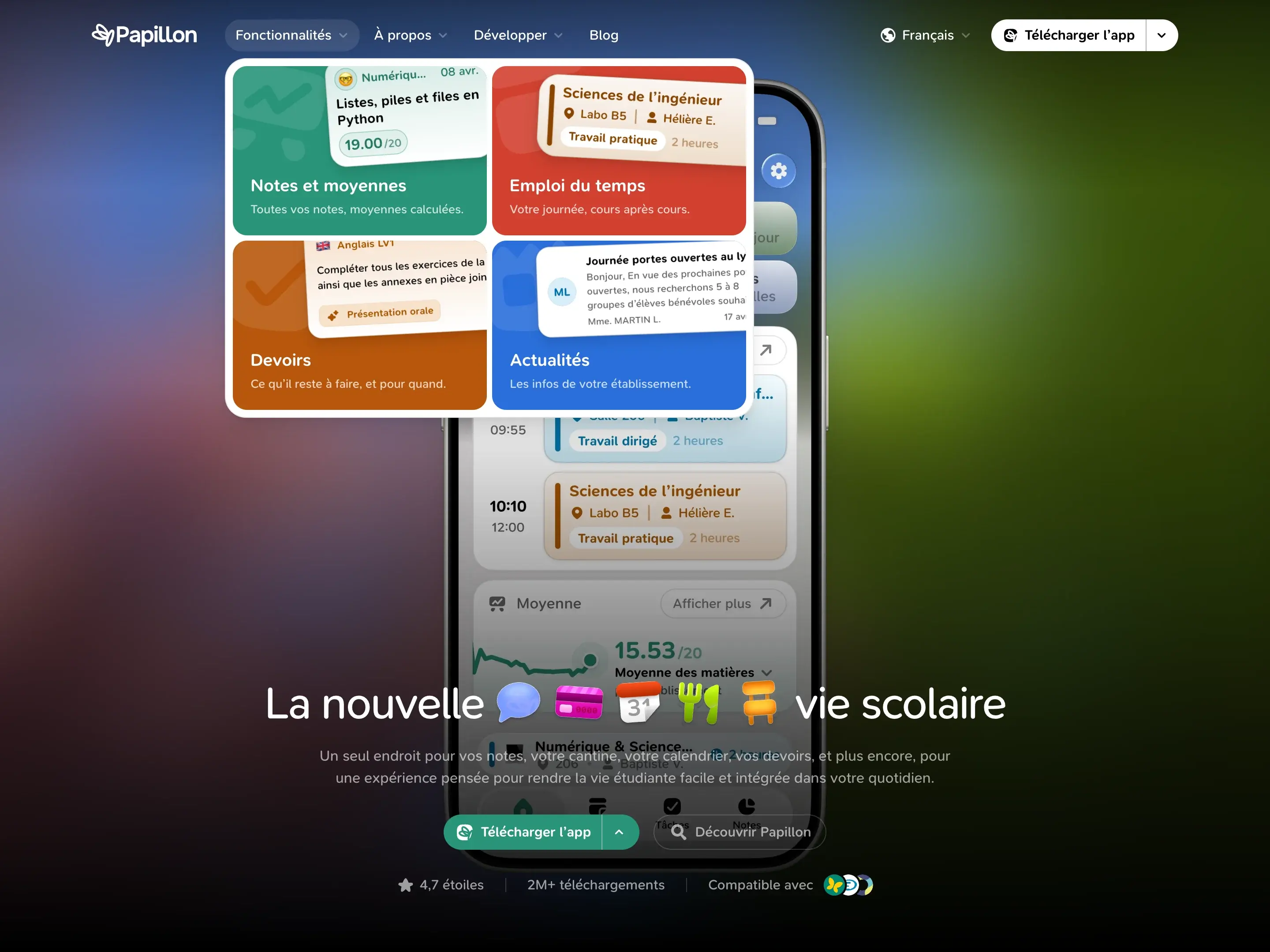
On hover, a single highlight slides from one item to the next. And the download button hides a small menu, to pick your store directly or join the betas.
On mobile, the menu opens full screen, with a submenu for each section.
The home page
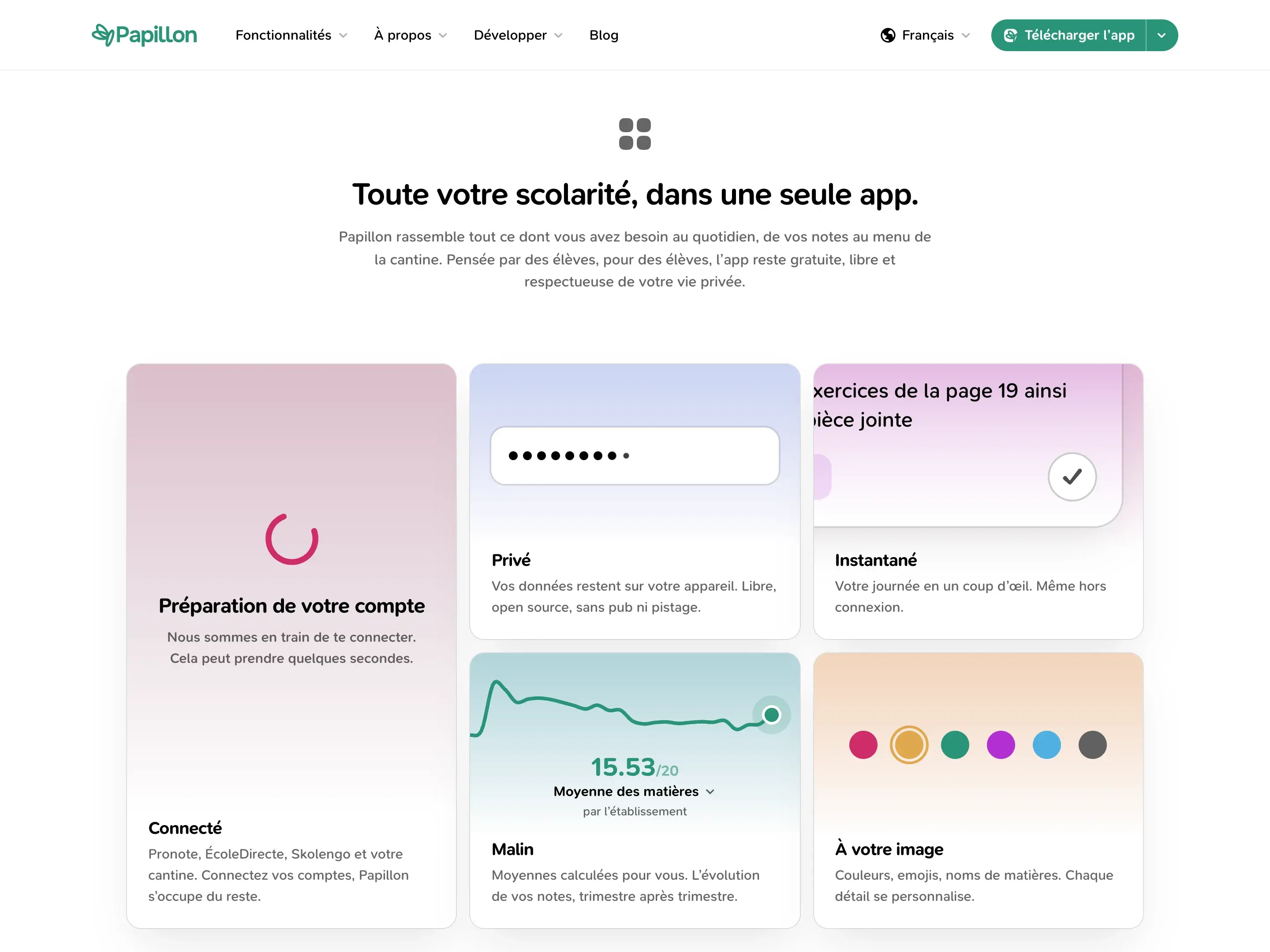
The home page was rewritten from scratch. It starts with a grid of animated cards that sum up Papillon in five words: Connected, Private, Instant, Smart and Yours. Each card has its own little live illustration: an account signing in, a masked password, homework being checked off, an average curve or a color picker.
Then come:
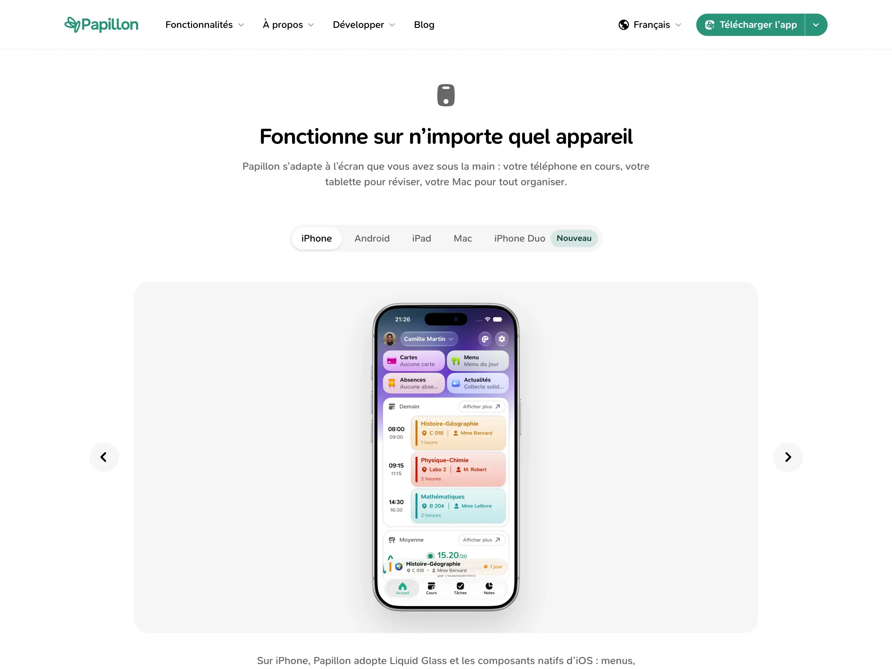
- Devices: iPhone, Android, iPad, Mac and iPhone Duo, each with its own screenshots.
- How it works: how to sign in, in four steps, without creating an account.
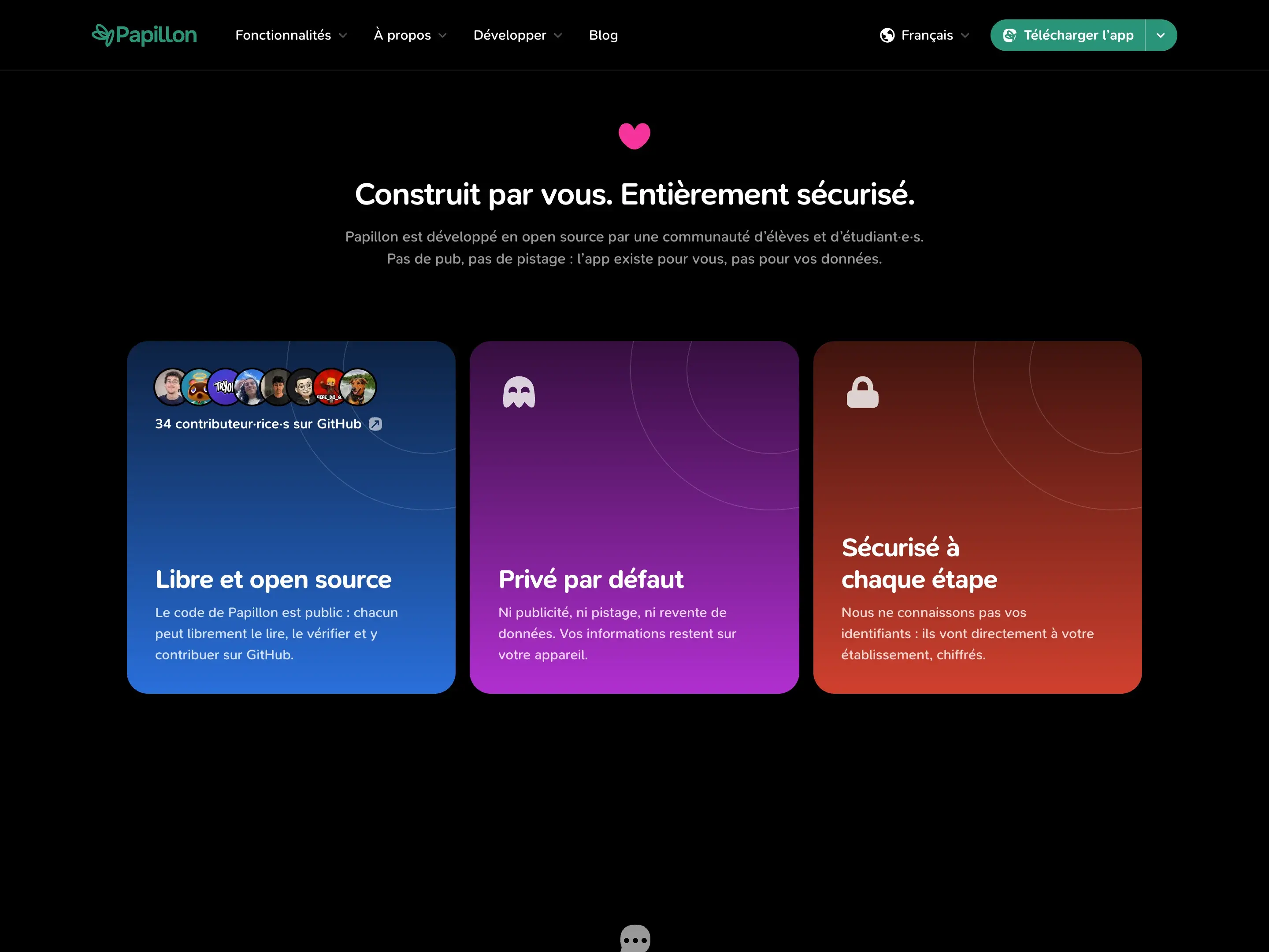
- Trust: open source, privacy and security, with our GitHub contributors.
- Reviews: a stream of App Store and Play Store reviews, along with our numbers.
The trust section is dark, right in the middle of a light page. And it's a small detail we're quite proud of: as you scroll past it, the navigation bar automatically turns dark, then goes back to light right after.
A page for every feature
This is the biggest addition. Grades, schedule, homework and news now each have their own page.
And each page has its own color: green for grades, red for the schedule, orange for homework and blue for news. The whole page follows: the hero background, the icons, the buttons.
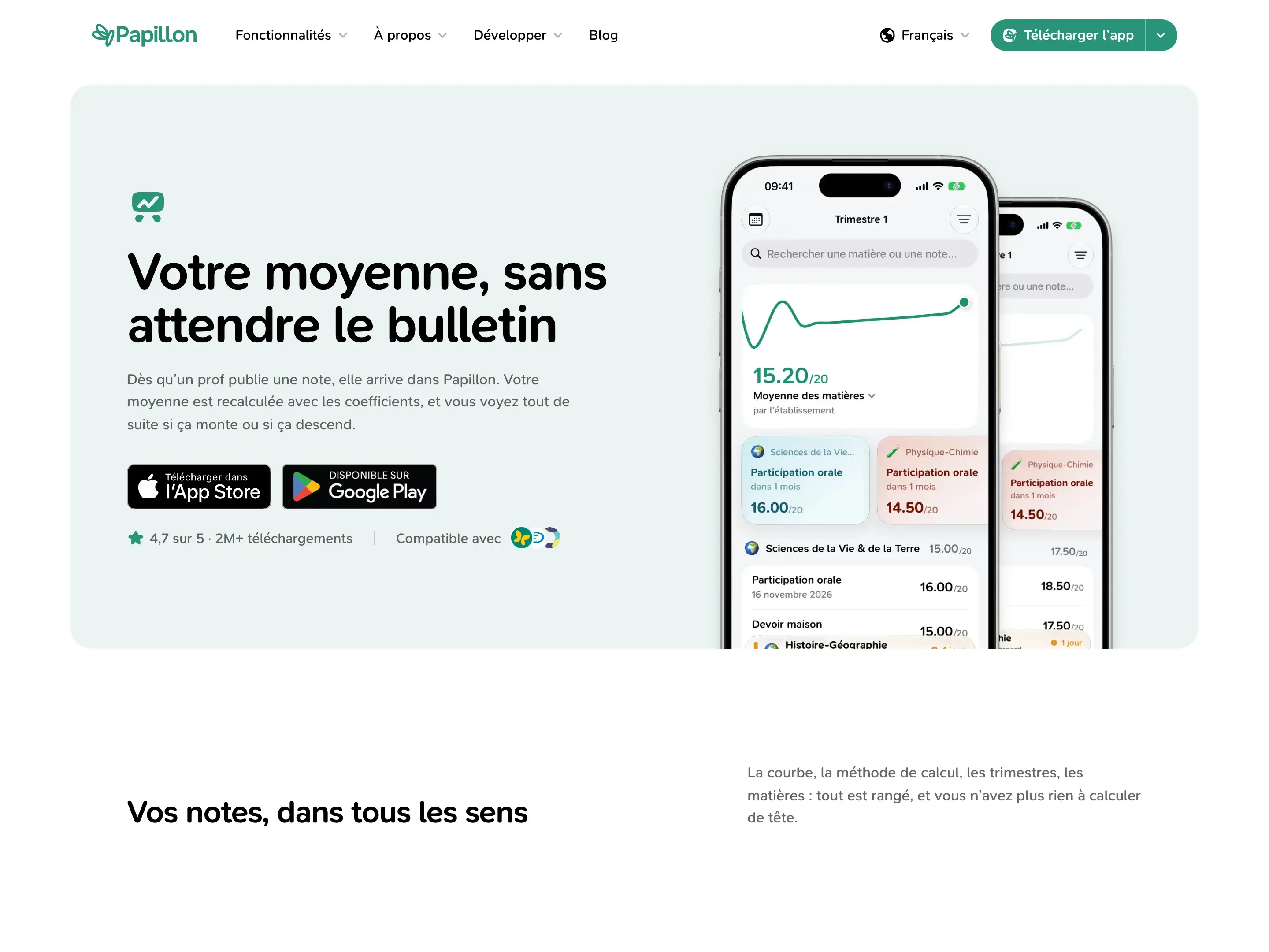
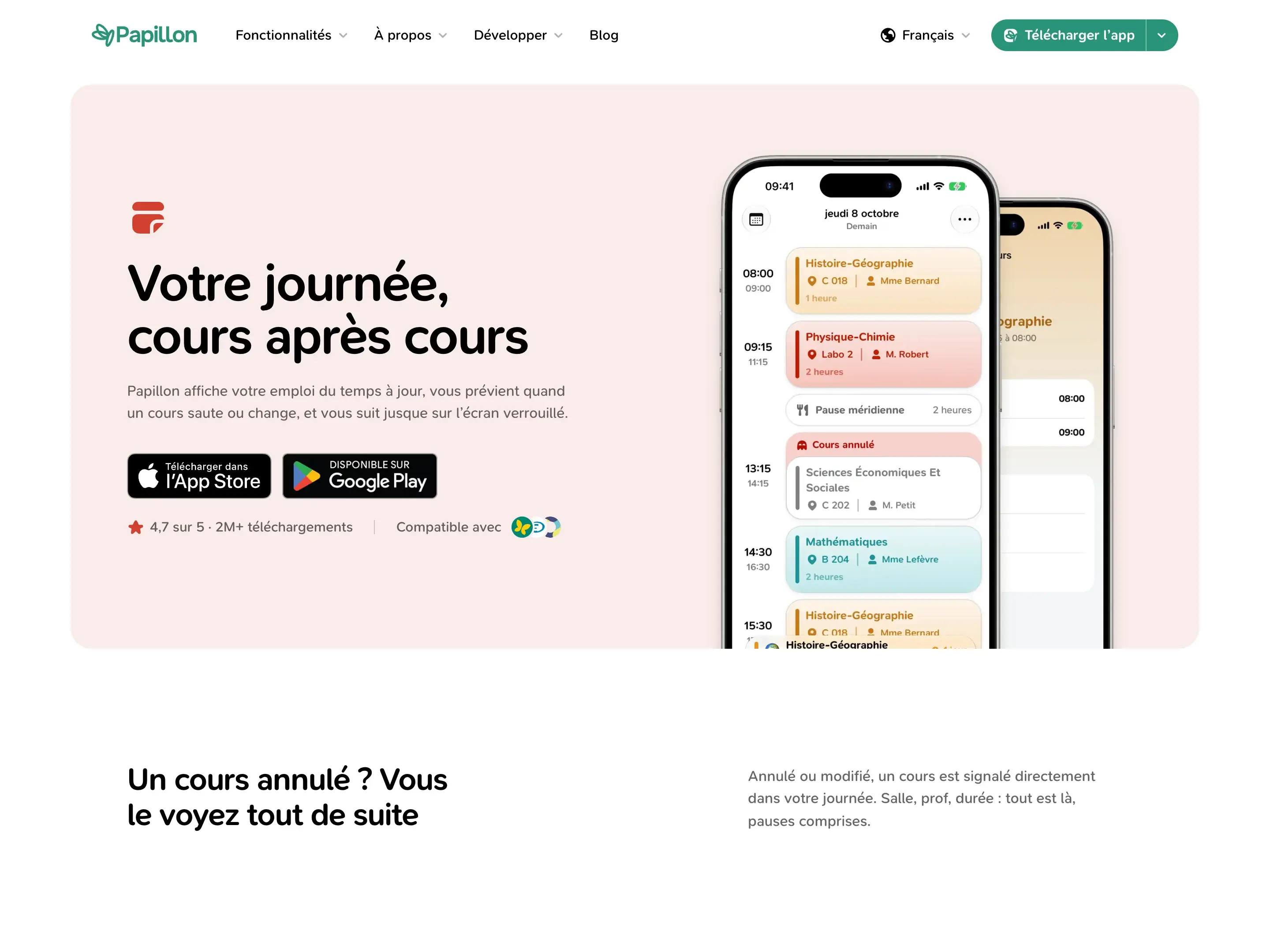
On each of these pages, we finally take the time to explain what the app really does: how the average is calculated with coefficients, how many points a grade adds or removes from your overall average, how a cancelled class shows up in your day... All with annotated screenshots, a section for large screens, and an FAQ for each feature.
The association and our story
The association page had a rather general tone: some values, a team, but not much that was concrete.
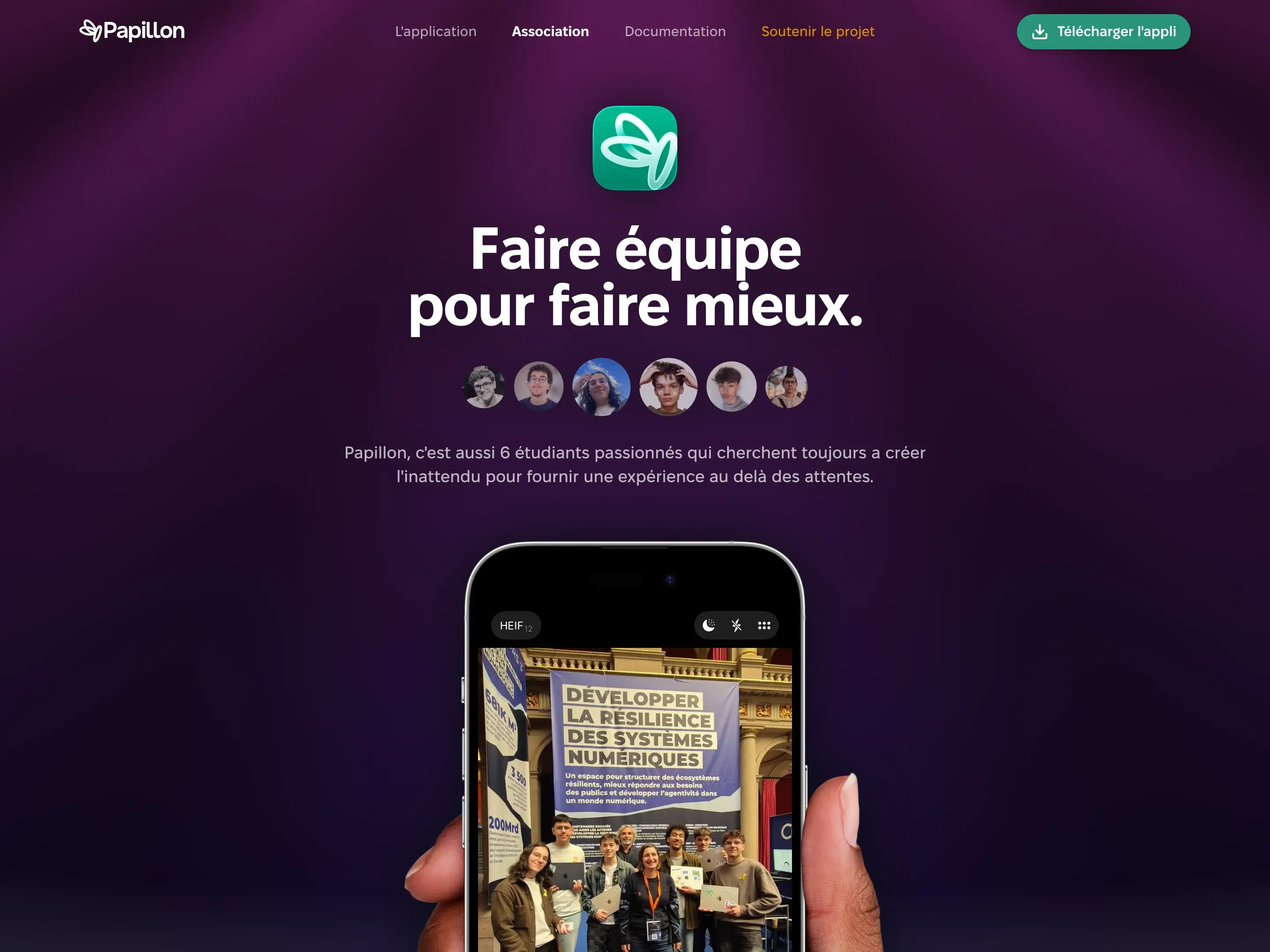
It was rewritten to tell who we really are: six students, a non-profit and an app we keep running between classes. The hero is a mosaic of photos taken at our events.
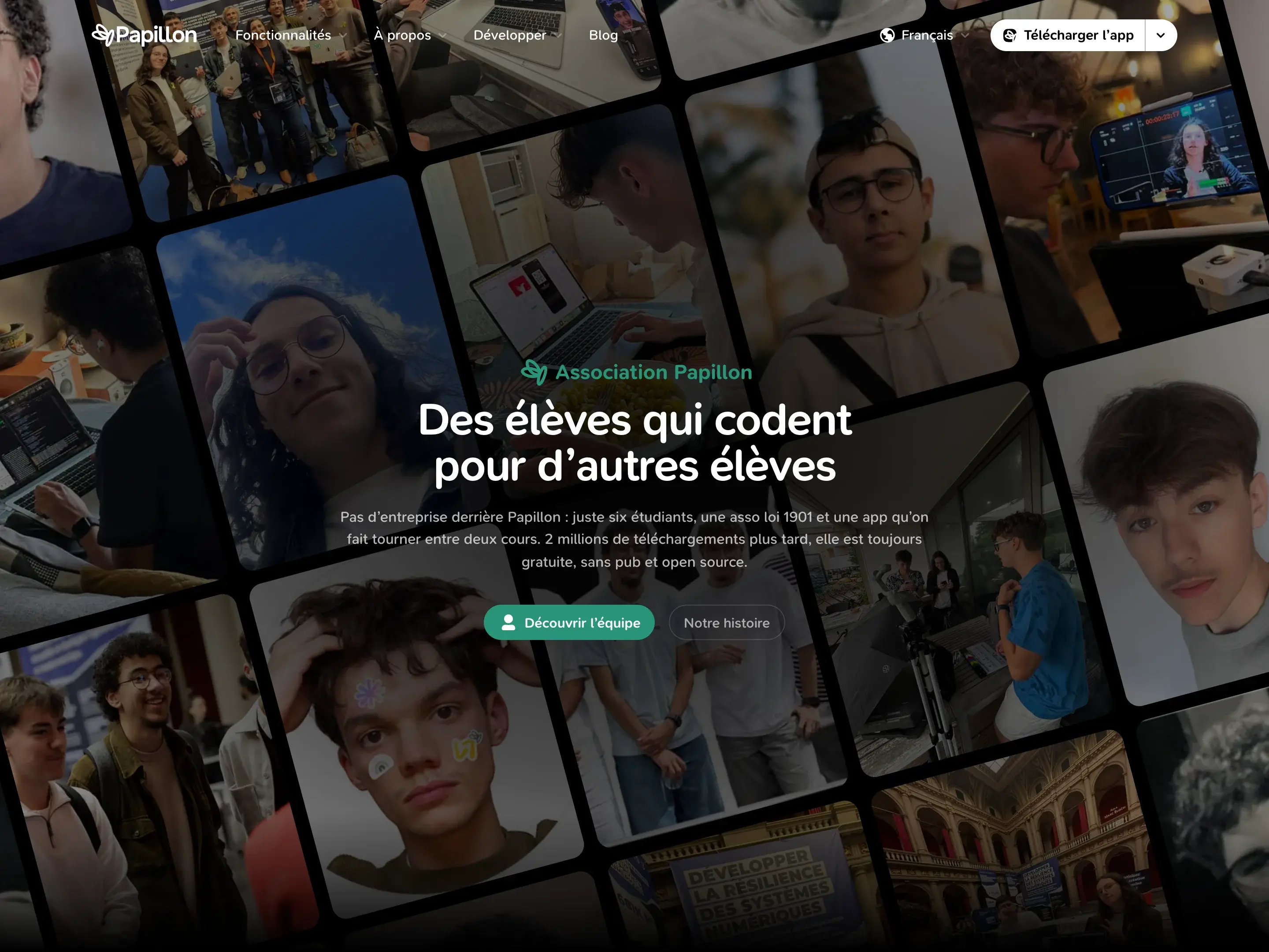
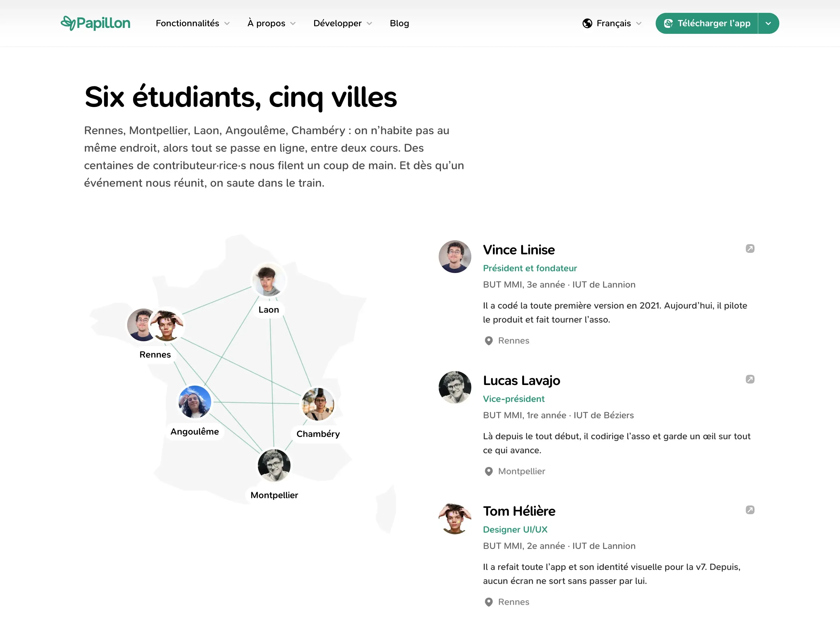
You'll also find a map of France linking our five cities, an introduction to each team member and their school, and our commitments: free, open source, and never keeping your credentials.
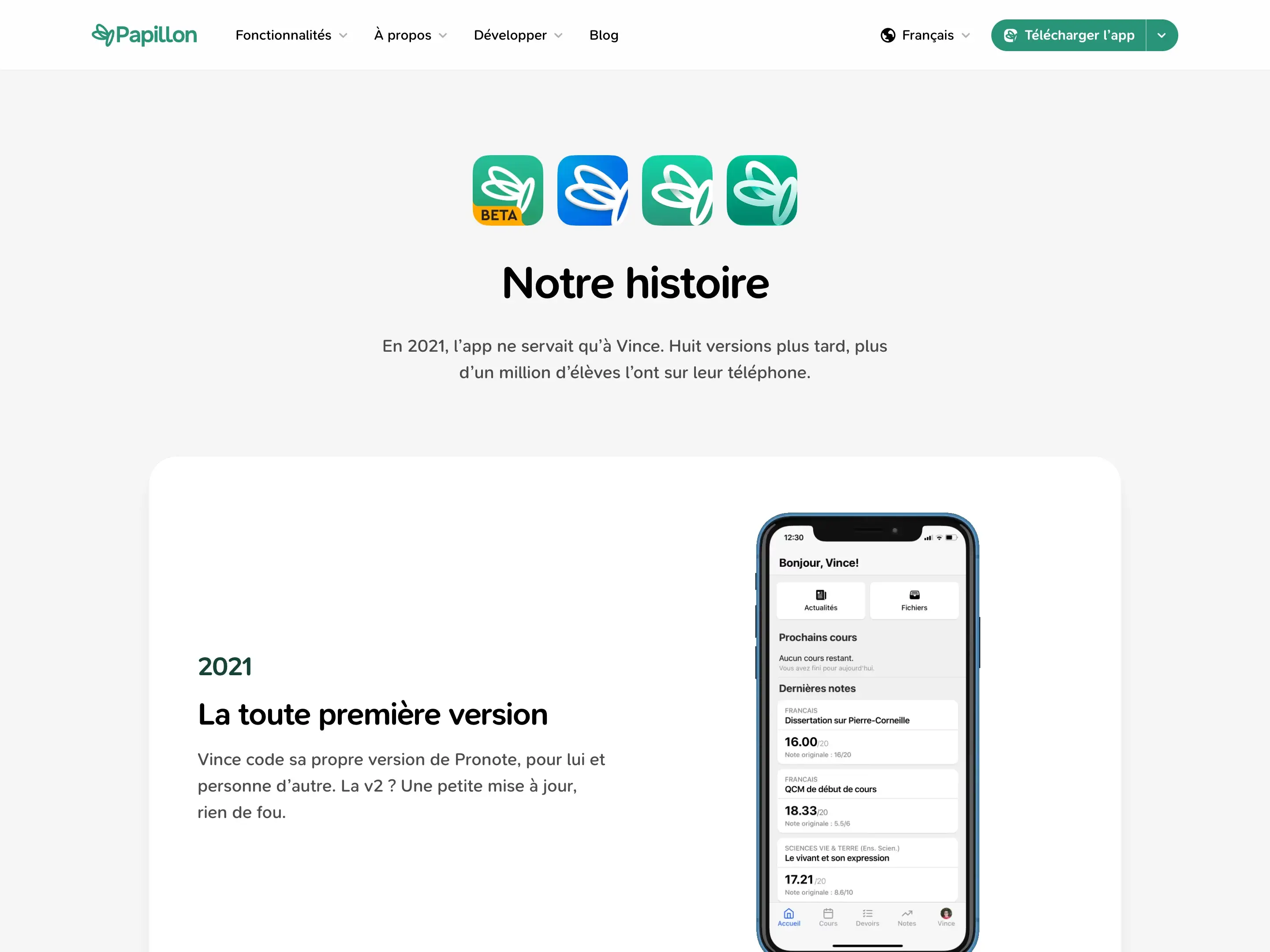
And to go further back, a new Our story page traces Papillon from 2021 to today: the very first version, which I coded just for myself, going open source, the name change from Pronote+ to Papillon, the move to React Native, and all the way to v8.
The blog
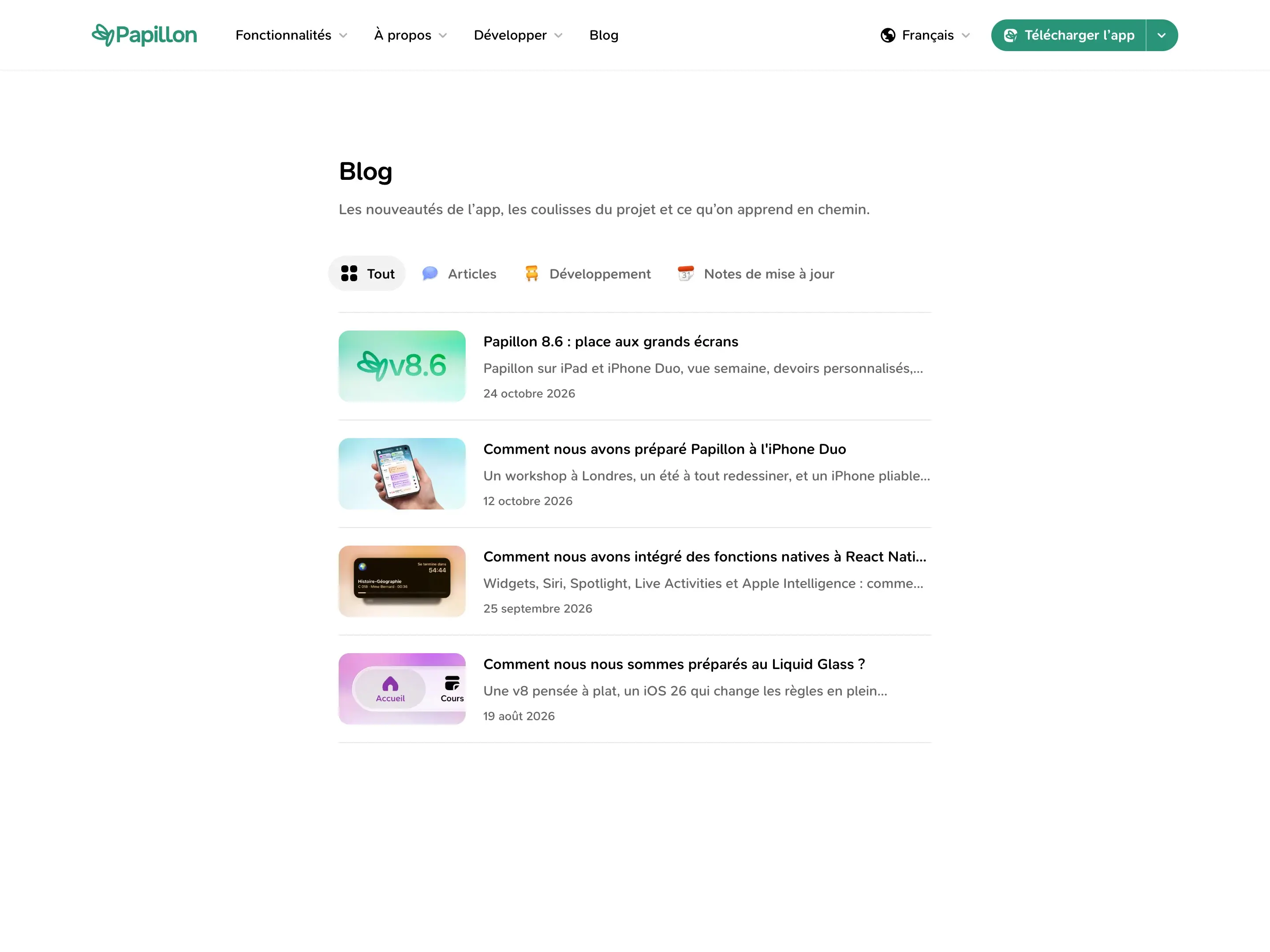
You're reading it! The site now has a blog, to talk about what's new in the app, what happens behind the scenes, and what we learn along the way.
Posts are sorted into three categories: Articles, Development and Release notes. Each one starts with a summary, and can be translated into English.
And also
A few other, more subtle changes:
- Download: a clearer page, with a QR code that takes you to the right store, every platform (iPhone and iPad, Android, Mac) and the betas.
- In English: the whole site is available in English, with a language picker in the navigation.
- Animations: all made with Motion, on a single shared curve, and toned down if your device asks for reduced motion.
- Sounds: small, subtle clicks accompany buttons and menus.
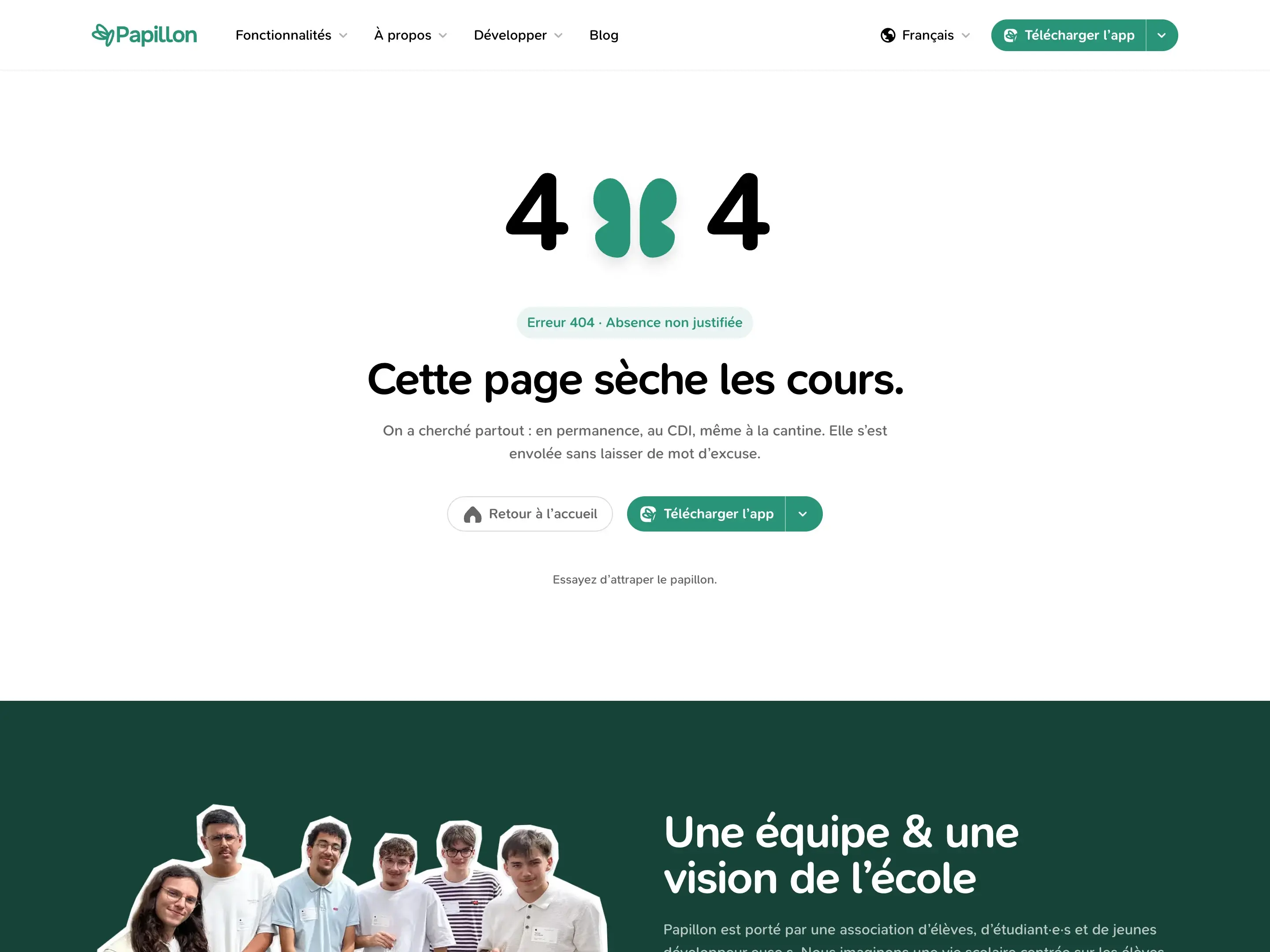
- The 404 page: a page that's skipping class, and a butterfly to catch.
Under the hood
On the technical side, the site is built with Next.js 16, Tailwind CSS 4 and Motion. Every color and size goes through shared tokens. That's what lets dark sections and feature pages switch themes locally, without rewriting a single component.
Texts live in dictionaries, one for French and one for English, and blog posts are written in MDX. So adding a post or a translation doesn't require touching the code.
Conclusion
The old site introduced Papillon. The new one takes the time to explain it: every feature, the team behind it, and everything that happens between two updates.
And above all, it finally looks like the app it presents.
Feel free to look around, and send us your feedback on Discord!