How did we get ready for Liquid Glass?
A v8 designed flat, an iOS 26 that changed the rules mid-development, and an app that blends a little more into the system with every release.
 Tom HélièreTranslated by AI
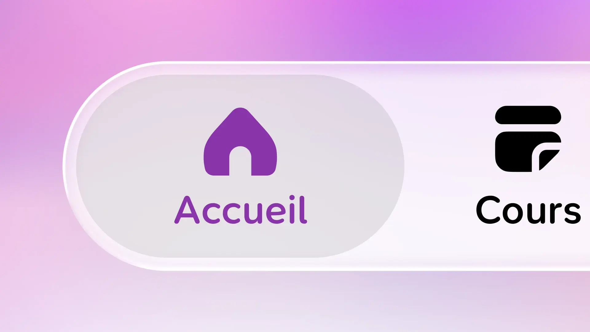
Papillon's v8 was designed flat when iOS 26 brought Liquid Glass right in the middle of development. Rather than redesigning everything, we first adapted with a few shadows and more contrast, then blended in more glass with each release, up to a fully Liquid Glass home screen in v8.4 and a splash of color on iOS 27.
Liquid Glass is Apple's new visual language, introduced with iOS 26 in June 2025. Bars, buttons and menus become pieces of glass that let the content underneath show through and react to touch.
For Papillon, it arrived at an odd moment: right in the middle of developing v8.
So how did we get ready for it?
A v8 designed flat
Around April–May 2025, we started designing and then developing Papillon v8. At that point, nobody knew yet what Apple was going to announce.
So the app was designed for a flat, static interface: a classic tab bar stuck to the bottom of the screen, headers separated from the content by a simple border, cards stacked one under another. And the design system followed the same logic: no gradients, no shadows, nothing sticking out. Just colors and borders.
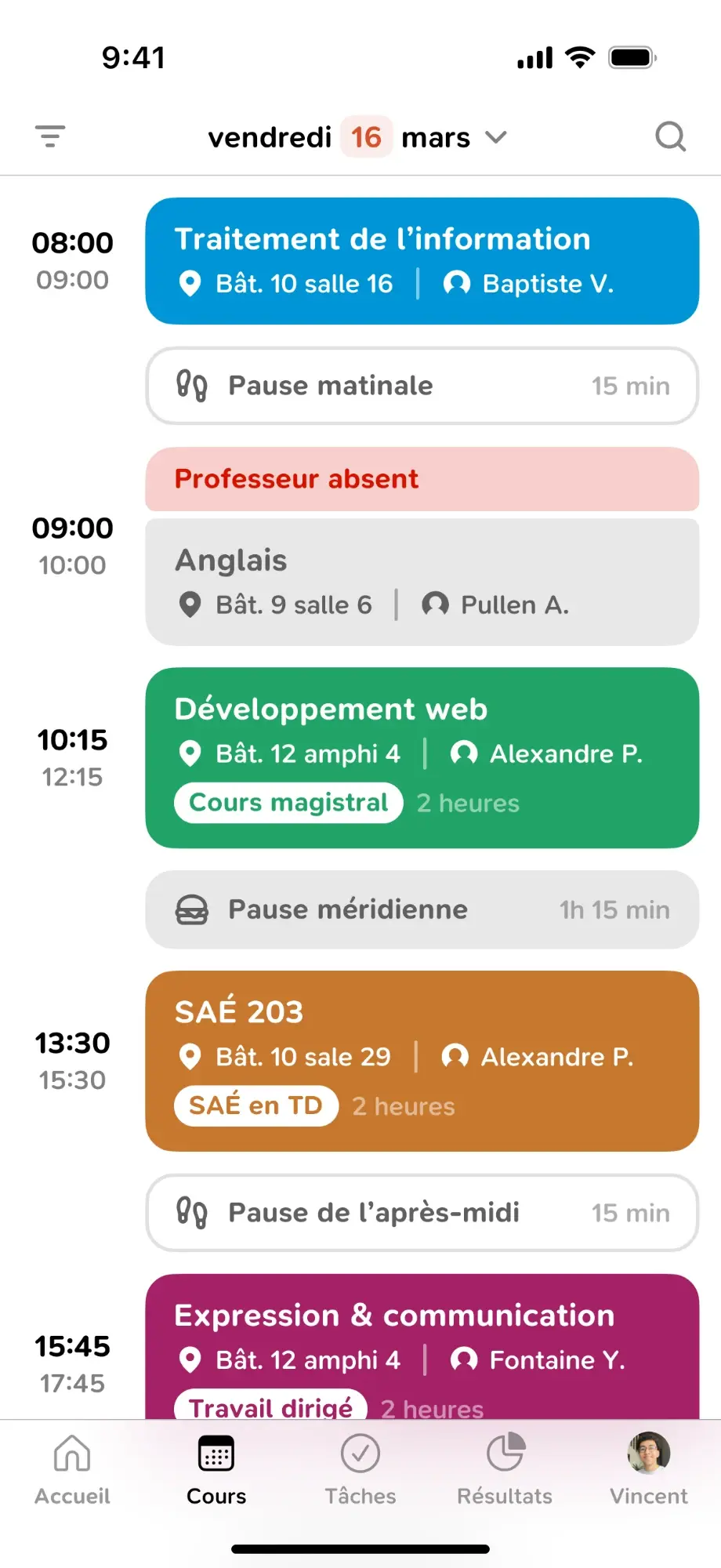
It was clean, readable, and it suited us just fine.
iOS 26 changes the rules
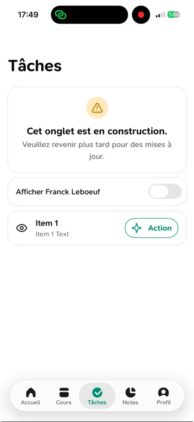
Then iOS 26 came out, while v8 was still in development. And with it, some things changed without us asking for anything. When building Papillon for iOS 26, the tab bar became a floating glass bar, and the header buttons turned into Liquid Glass pills. All enabled by default.
So our first build on iOS 26 looked a bit odd: a flat interface, with a piece of glass floating on top.
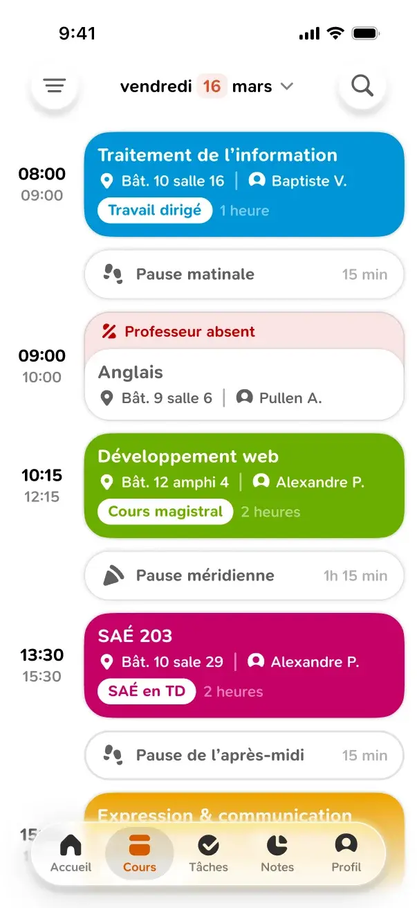
Redesigning everything a few weeks before release was out of the question. So we adapted slightly: a few shadows to lift elements off the background, and more contrast so everything stays readable around the glass. Enough for v8 not to clash with the rest of the system.
First explorations
Shortly after v8 came out, we started asking ourselves another question. Adapting to Liquid Glass is good. Truly integrating with it is better.
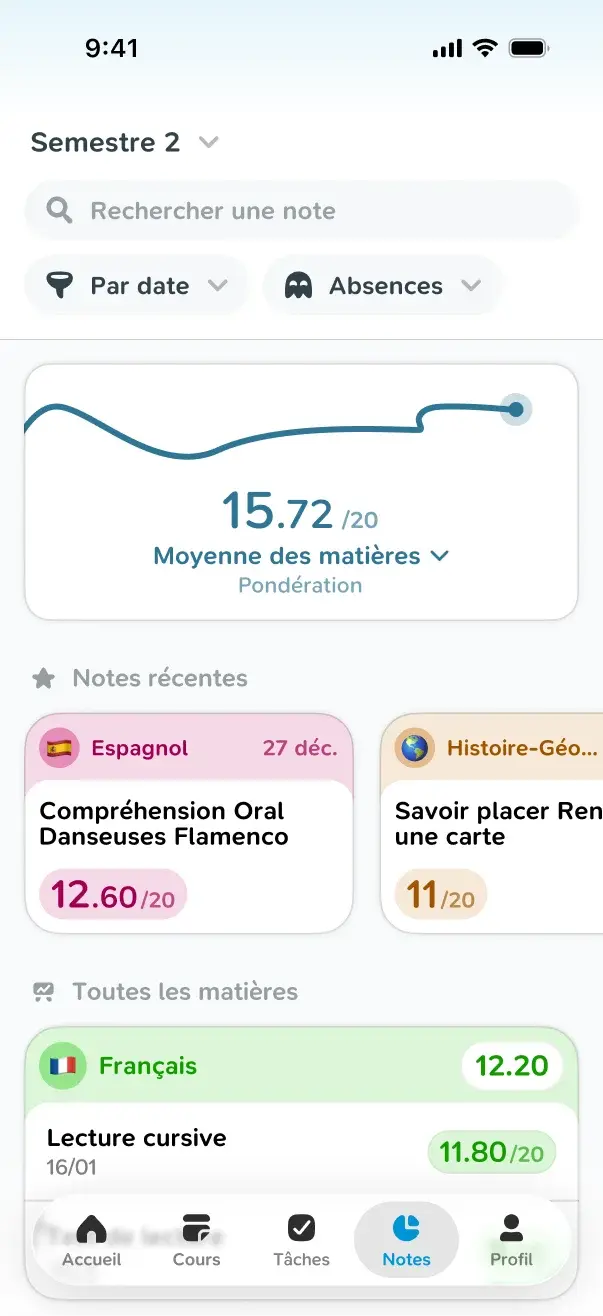
So we started a few interface explorations, to see how far we could take the material in Papillon. Like this grades screen, with its bluish header and pill-shaped filters.
More glass in the app
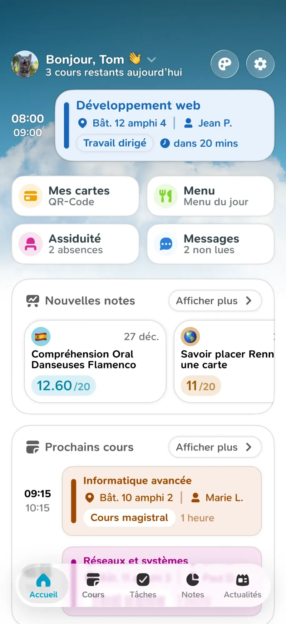
Little by little, Liquid Glass then made its way into Papillon, notably:
- Headers: their buttons turn to glass, like in Apple's apps.
- Papicons: our icons were adapted to the new tab bar, to stay readable on glass.
v8.4: an all-glass home screen
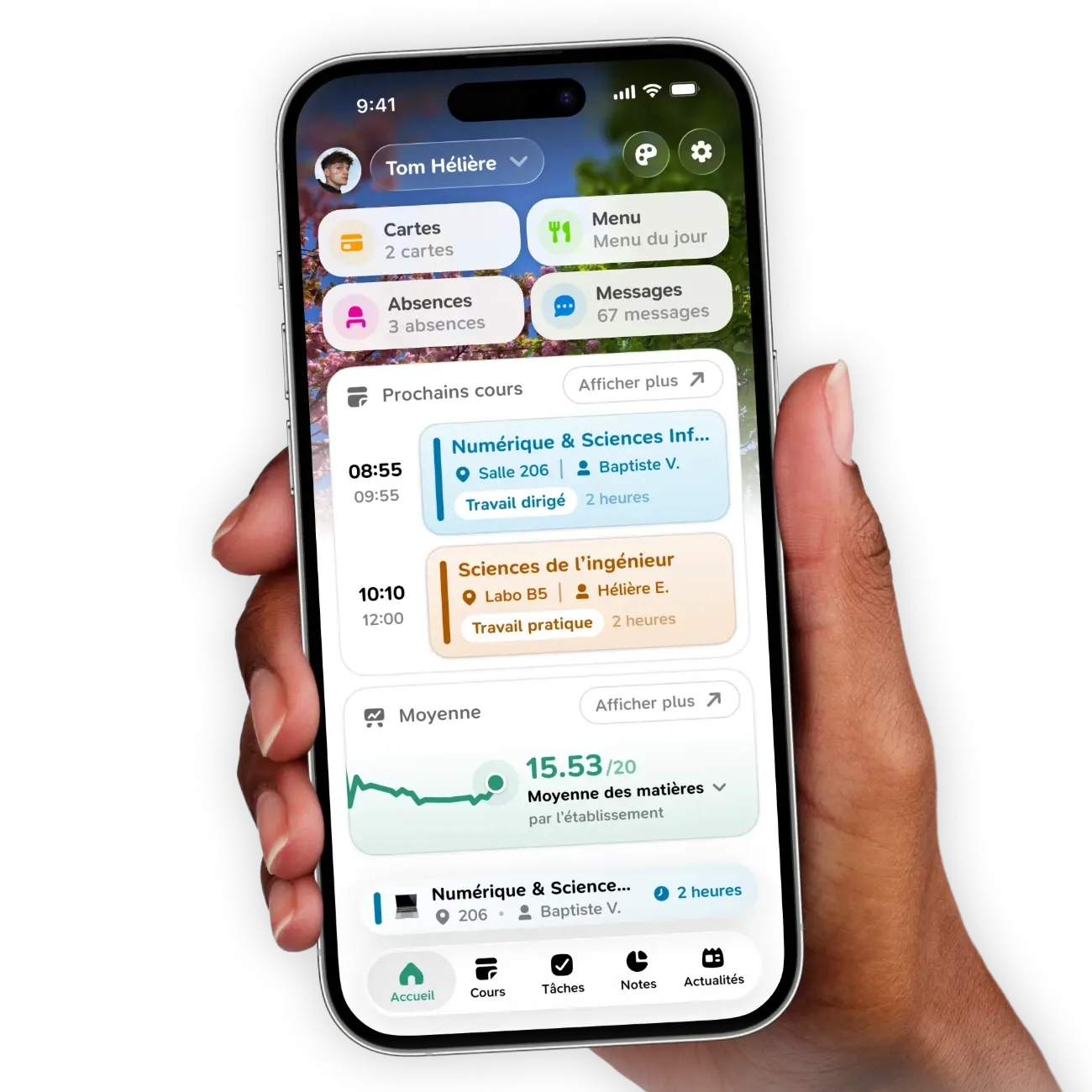
For v8.4, we decided to go further. This time, the whole home screen switches to Liquid Glass: shortcuts, classes and cards. And behind them, a more immersive, customizable wallpaper that shows through the glass.
iOS 27: time for color
With iOS 27, Apple refined Liquid Glass. It's more readable, and above all much easier to integrate.
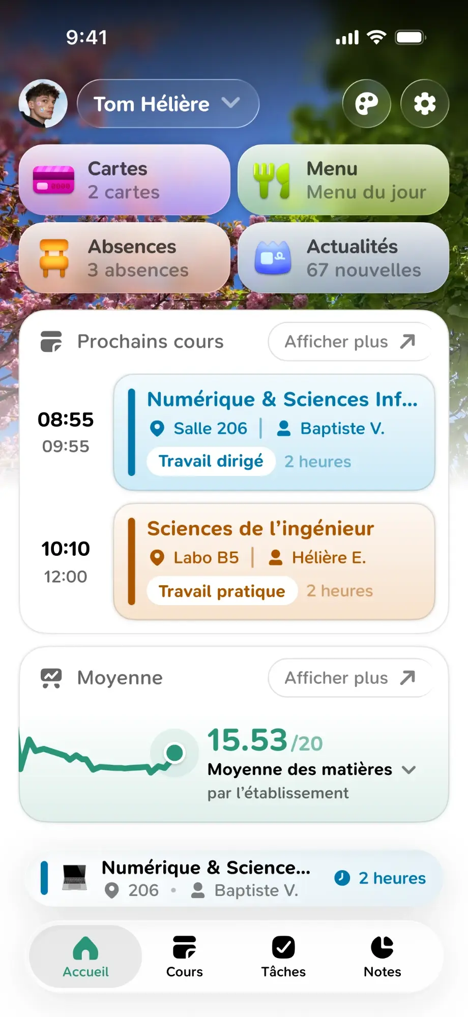
So we took the opportunity to extend our use of the material even further: color in the glass, and more Liquid Glass containers. The goal: a more fun interface, better integrated with the OS.
Conclusion
We started v8 with a completely flat interface, and iOS 26 changed the rules along the way. Rather than throwing everything out, we moved forward step by step: first adapt, then explore, then integrate the glass a little more with each release.
The biggest lesson from this project is that an app doesn't live on its own: it lives in a system that evolves. And it's better to let iOS help us than to fight it.
Papillon is open source on GitHub. Feel free to try the latest version and send us your feedback!