How we got Papillon ready for the iPhone Duo
A workshop in London, a summer spent redesigning everything, and a foldable iPhone that asked for almost nothing on launch day.
 Vince LiniseTranslated by AI
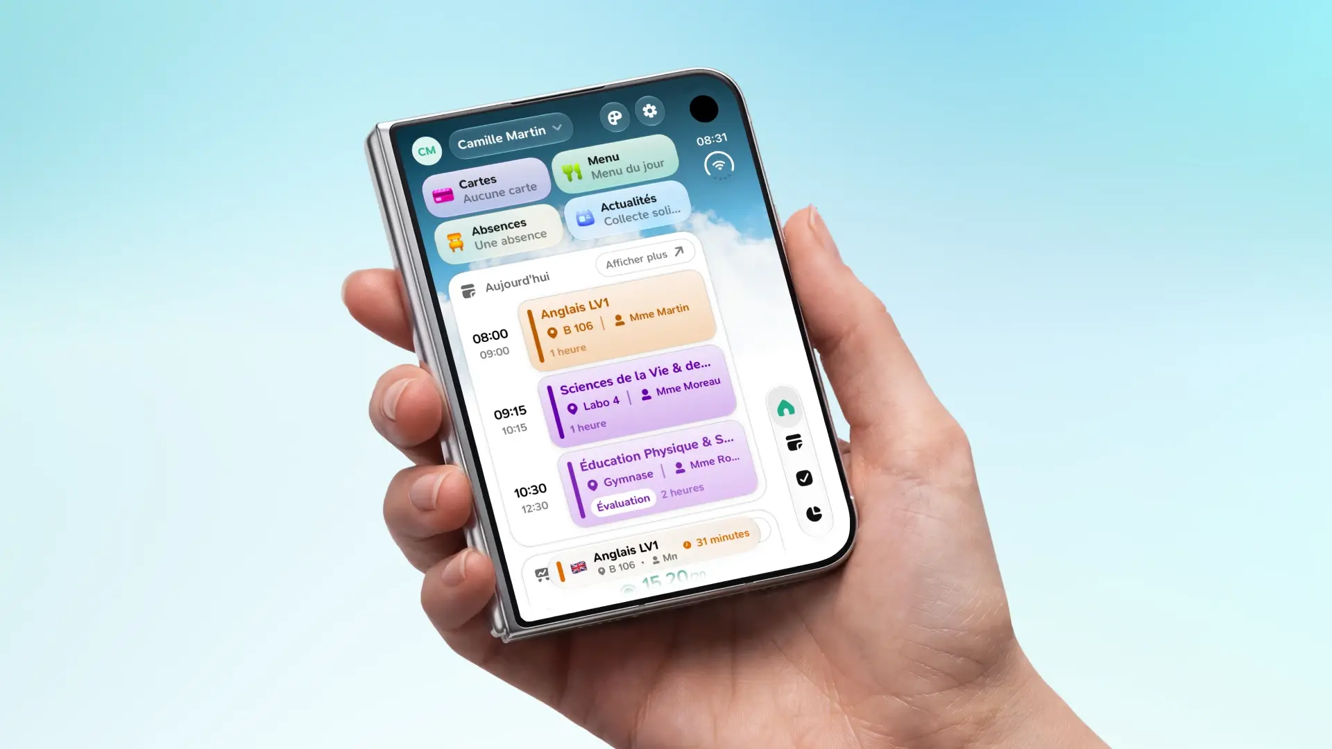
To get Papillon ready for the iPhone Duo, we first made the app resizable after an Apple workshop in London, then redesigned the main tabs for large screens. After a second workshop in Paris, we swapped our homemade navigation bars for the ones from iOS. The result: almost nothing left to do on launch day, and the iPad version benefits too.
The iPhone Duo is Apple's new foldable iPhone, released in September 2026. Closed, it's a regular iPhone. Open, it's almost a tablet. And an app can switch from one to the other in a second, without even closing.
It sounds trivial, but for most apps it's a real headache. For Papillon, there was almost nothing to do on launch day.
So how did we get there?
An app designed for a single screen
Since day one, Papillon was designed for one thing: a phone held upright, whether on iPhone or Android.
There was an iPad version, but let's be honest: it wasn't really usable. The app stretched across the whole width of the screen, lists were miles wide, and some screens were cut off in the wrong place. In fact, we turned it on, then off, then on again... without ever really taking the time to deal with it.
The problem was that every screen assumed it knew the size of the phone. And the day that size changes, everything breaks.
June: a workshop in London

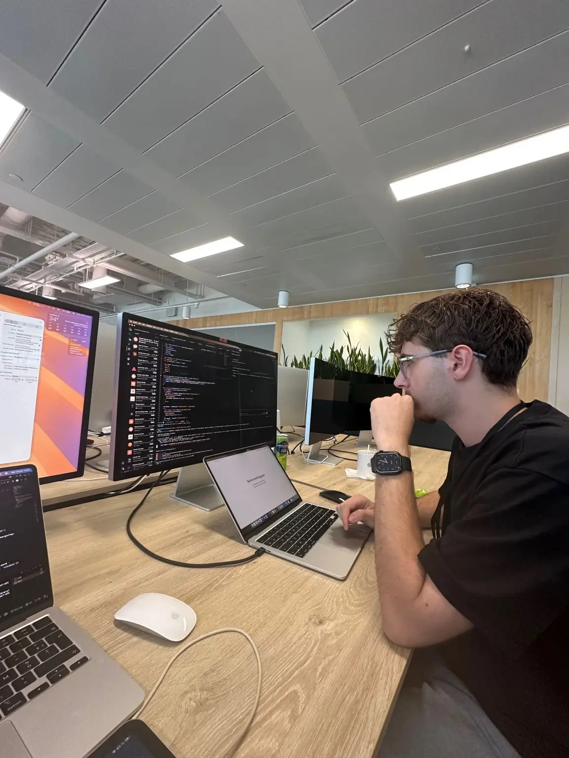
Vince Linise et Lucas Lavajo

In June, Lucas and I had the chance to attend a workshop hosted by Apple in London. The goal was to discover what's new in iOS 27 and get our apps ready for what was coming.
We learned a lot during this workshop, especially about the new iOS interfaces and how Apple sees the apps of tomorrow. But one message kept coming back: apps must be able to change size at any moment. No more assuming an iPhone is always the same width.
So as soon as we got back, I started making Papillon resizable. The first step was very simple: a small helper that looks at the window width and tells whether we're on a "large" screen or not.
const useResizable = () => {
  const { width } = useWindowDimensions();
  const isLarge = width >= 600;

  return { isLarge };
};
With that, the home screen could already switch to two columns when there's room. And since the width is read continuously, the app adapts on its own as soon as the window changes.
const { isLarge } = useResizable();

<FlatList
  data={widgets}
  numColumns={isLarge ? 2 : 1}
/>
It wasn't perfect yet, far from it. But for the first time, Papillon no longer broke when the screen size changed.
August: redesigning everything
Tom Hélière, Lucas Lavajo, Rémy Godet et Vince Linise


An app that doesn't break is good. An app that really makes the most of a large screen is better.
So in August, Tom, Lucas, Rémy and I got together to redesign Papillon's main tabs, one by one. The goal was simple: make every screen resizable, and finally iPad-ready. For each screen, we asked ourselves the same question: what would we do with all this extra space?
- Home: widgets are arranged in several columns, like a dashboard.
- Grades: averages stay on the left, and the latest grades show up on the right instead of below.
- Schedule: on large screens, a full-week view appears, with one column per day.
- Cards and login: the cafeteria and login screens are centered instead of stretched.
For lists, Rémy set up a "masonry" column system, like on Pinterest: each card takes the height it needs, and columns fill up without leaving gaps.
The weekly schedule also had a little surprise in store for us. Saturday and Sunday should only appear if you actually have classes on those days. Except the app only loads a few weeks at a time: when moving to the next week, Saturday disappeared, and all the columns suddenly changed width. So we decided that once a Saturday has had classes, it keeps its column until the app is closed.
August: off to Paris
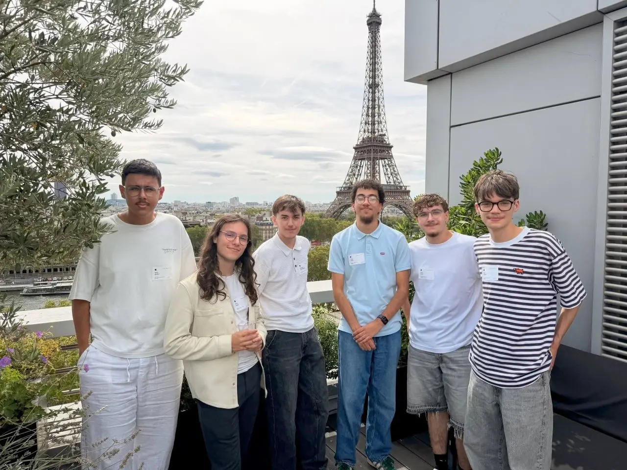
A few weeks after London, we were invited to another workshop hosted by Apple, this time in Paris, with a pretty nice view of the Eiffel Tower. The perfect opportunity to show our work in progress, and above all to get feedback from Apple's teams.
We showed up with our new screens under our arm, feeling pretty proud. But talking with Apple's teams made us realize one thing: our homemade tabs and headers behaved much worse than the iOS ones as soon as the screen size changed.
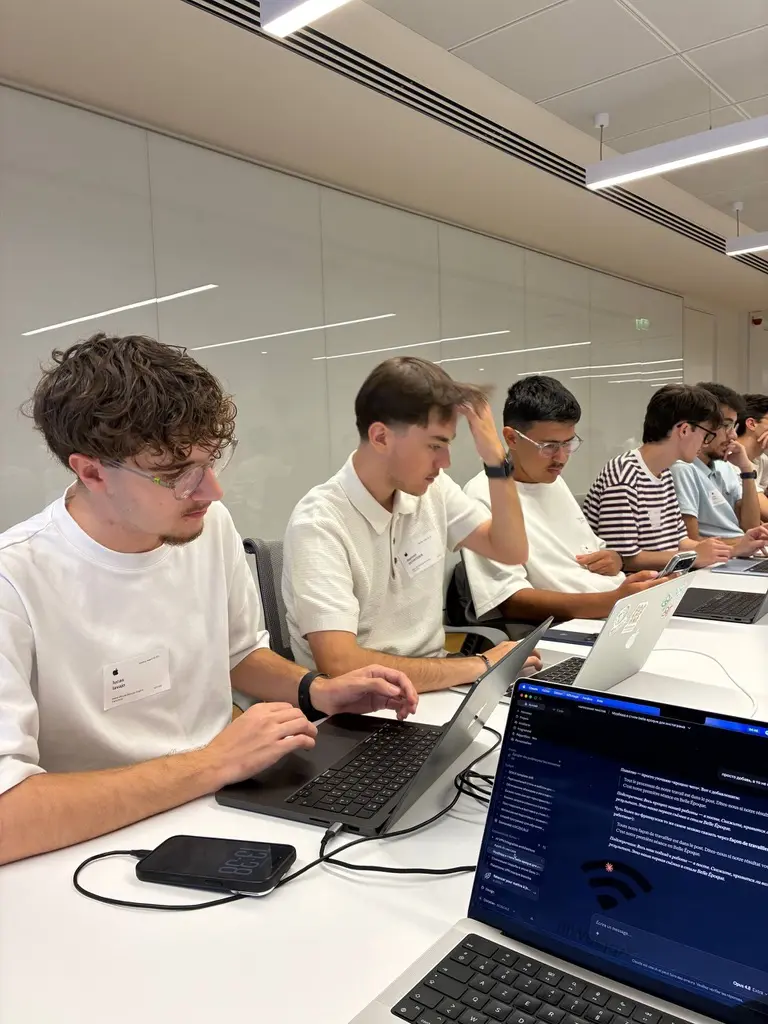
That's when we understood that we were fighting iOS instead of letting it help us.
August: letting iOS do the work
Right after Paris, we made a choice that would change everything: stop drawing the navigation bars ourselves.
Until then, Papillon's headers and tabs were homemade, in React Native. They looked like the iOS ones, but they weren't the iOS ones. And with every size change, we had to recalculate their position, their height, their margins...
So we replaced them with Apple's real components, in SwiftUI, thanks to Expo Router. The title and buttons are declared directly in the page, and iOS takes care of displaying them.
<Stack.Title>{t("Tab_Calendar")}</Stack.Title>

<Stack.Toolbar placement="left">
  <Stack.Toolbar.Button icon="calendar" onPress={toggleCalendar}>
    {dayLabel}
  </Stack.Toolbar.Button>
</Stack.Toolbar>
The result: Papillon finally has the same feel as Apple's apps, with the same animations and the same glass effect. And that changed everything. Above all, when the screen changes size, iOS resizes everything, automatically.
One last detail: on a large screen, content should never stick to the edges or slip under the notch. So a small helper calculates the left and right margins depending on the device, and every screen uses it.
export const useSafeHorizontalPadding = (base = 16) => {
  const insets = useSafeAreaInsets();
  return {
    paddingLeft: insets.left + base,
    paddingRight: insets.right + (insets.right > 10 ? 0 : base),
  };
};
September: the iPhone Duo arrives
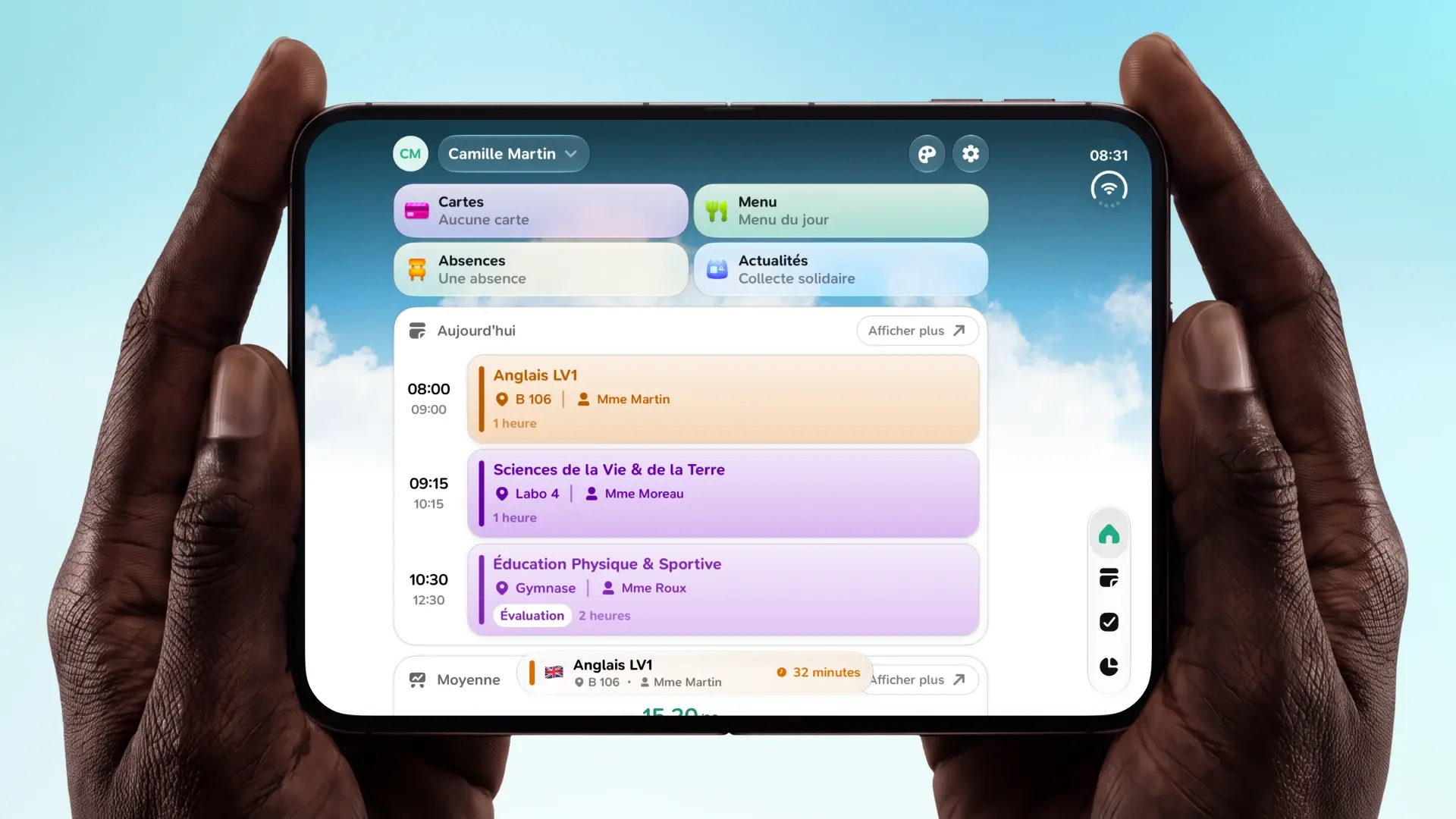
We never got our hands on an iPhone Duo. But Xcode lets you simulate it, and fold or unfold it at will. So we launched Papillon on it, a bit nervous, I'll admit. We opened it, closed it, opened it again...
And it works!
Closed, Papillon looks like it does on any iPhone. Open, the home screen switches to two columns, grades sit side by side and the schedule shows the whole week. All without restarting the app, right in the middle of using it.
We still had to make a few adjustments:
- The form factor: we added an
isTabletvalue that doesn't depend on the screen orientation, so the app doesn't change its mind when you rotate the phone. - Wallpapers: the wallpaper picker miscalculated its width on some devices.
- Homework: the homework week picker was reworked to use the full width.
In the end, a few lines of code, where it could easily have taken thousands.
Conclusion
We could have waited to have an iPhone Duo before dealing with it. But thanks to the work started this summer, the iPhone Duo asked for almost nothing. And along the way, Papillon's iPad version finally became usable.
Thanks to how well the whole team complements each other, Papillon is now a more native, smoother app, and above all ready for the screens of tomorrow.
The biggest lesson from this project is that an app should never assume the size of its screen. Phones change, and the app has to keep up.
Papillon is open source on GitHub. If you have an iPhone Duo or an iPad, feel free to try it and send us your feedback!